Why Your Brand Colours Don’t Always Match — and How to Fix It
Have you ever picked up your freshly printed business cards or brochures and thought, “Wait… why does this blue look different?”
You’re not imagining things. Colour consistency is one of the most common frustrations we hear from clients. And nine times out of ten, it comes down to how those colours were set up before printing.
At our shop, we see this all the time, and it’s usually an easy fix once you understand a few basics about Pantones and colour spaces. Whether you’re working with Burke or another Edmonton printer or a Calgary printer, this small piece of knowledge can save you a lot of time, money, and headaches.
The Basics: How Colour Works in Design and Print
When it comes to colour, there are a few systems at play. A clear understanding of the following will help to ensure your print pieces turn out beautifully.
- RGB – For Screens
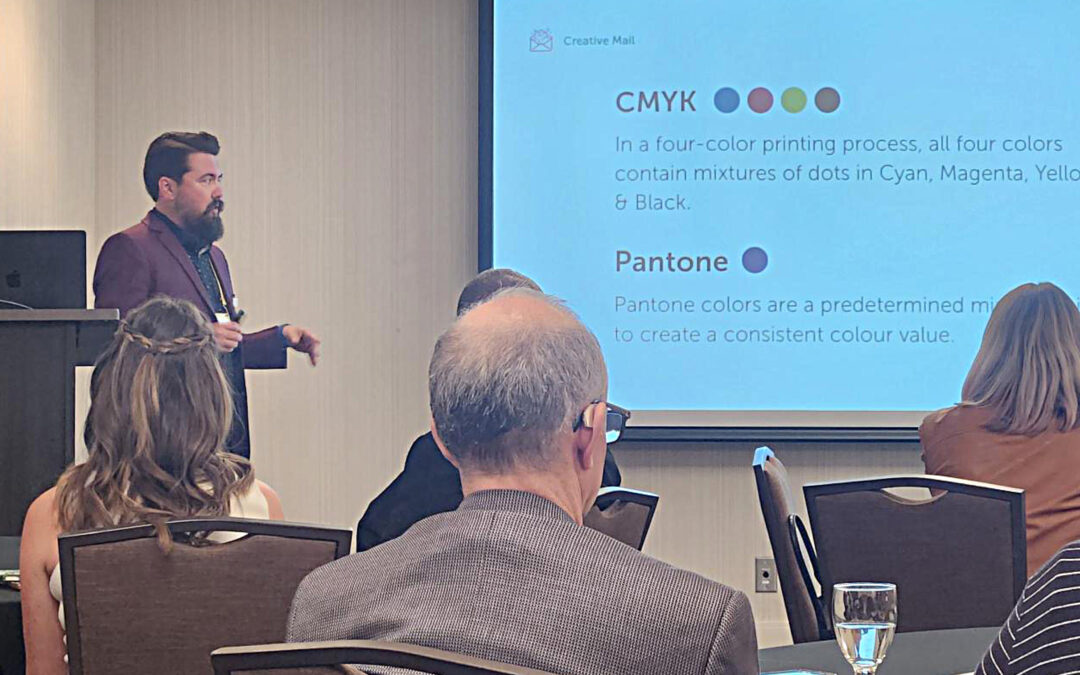
RGB (Red, Green, Blue) is what you see on screens. This includes your website, social media, and digital ads. Those colours are created with light, not ink. So while they pop beautifully online, they don’t always translate the same way in print. - CMYK – For Print
CMYK (Cyan, Magenta, Yellow, and Black) is what printers use to create full-colour pieces. These inks mix together to form colours, but since it’s a blending process, there can be small shifts in tone between print runs, paper types, or printers. - Pantone – For Precision
Pantone colours (also called PMS colours) are pre-mixed inks designed to be exact – every single time. If your brand red is your signature, Pantone ensures that the same red looks identical whether you print it in Edmonton, Calgary, or anywhere else.
Why Colours Look Different from Screen to Print
Here’s the thing: every device and printer interprets colour a little differently.
So when you send an RGB file (meant for screens) to print in CMYK, the printer has to “translate” those colours. This is where things can shift.
A few more reasons your brand colours might not look the same:
- Your files were saved in the wrong colour mode.
- You printed on a different paper finish (matte vs glossy makes a big difference).
- The printer used a different machine or ink set.
- There wasn’t a colour proof before printing.
Sound familiar? You’re definitely not alone, but that’s also why working with an experienced Edmonton printer or Calgary printer like Burke Group matters.
How to Keep Your Colours Consistent
Here are a few easy things you can do to protect your brand’s look:
- Ask for a colour guide.
Make sure your designer provides Pantone, CMYK, RGB, and HEX codes for all your brand colours and keep them handy for every project. - Always request a proof.
A printed proof lets you see exactly how your colours will look before you commit to a full run. - Stick with one trusted printer.
Working with the same print partner means they already know your brand colours, preferred materials, and expectations and can match your past projects. - Check your file settings.
Before you send anything to print, make sure your brand colours are ALWAYS in Pantone. Even CMYK will look different from device to device. If Pantone is provided, we can properly convert them depending on the press, stock and finish to ensure your colours are as on brand as possible . If you’re not sure, your printer can help.
Remember…
Your brand colours aren’t just colours, they’re part of your identity. The right shade of blue, red, or gold can make your materials instantly recognizable and professional.
When those colours are off, it can send the wrong message (even if only subconsciously).
So next time you’re sending a project to print, take a moment to double-check your colour setup. If you’re not sure where to start, one of our Burke Group team members would be happy to guide you through. A little extra care goes a long way in keeping your brand looking sharp and consistent across everything you do.
Looking for a Reliable Print Partner?
Whether you’re in Edmonton or Calgary, our team can make sure your brand colours look exactly as they should. Every. Single. Time.
We handle all the technical details, so you can focus on running your business. Click the contact button to review your project with our team.